Adding a Contact Form in Hexo

Recently I ported my WordPress blog to Hexo. I became frustrated with the invalid login attempts to my site driving up the costs of hosting on my Pay-As-You-Go plan with Azure. The benefit of a static site created by Hexo is that I do not have to worry about those attacks, however static sites do come with some drawbacks.

The first drawback I encountered was creating a contact form for my site. Since there is no communication between the browser and the server to send an email from the form I used a third-party client FormSpree. The benefit here is they check the message before sending it to me. I have since used their service, which is free for under 1,000 messages per month, for a couple of clients wanting static sites.

I started by creating a contact page in hexo and adding the page content to the index.md file generated by hexo.

1
hexo new page "Contact"
1
2
3
4
5
6
7
8
9
---
title: Contact
id: 1471
comment: false
---
Contact me for questions, comments, suggestions, or to request a topic for a post.
I am available for freelance web development on a per request basis.
If you are contacting me about freelance work please state so at the top of your message.

After writing this I created a template for the contact form. I want to have the option of creating multiple contact pages for various purposes such as blog content, podcast editing, or freelance work.

Using Bootstrap’s grid system I set the form to the left of the page and the content from the index.md to the right. I tried several variations and eventually found an example at www.knownly.com. This is also where I learned about the FormSpree. I adjusted the example to fit within the hexo framework and added some of my own style.

1
2
3
4
5
6
7
8
9
10
11
12
13
14
15
16
17
18
19
20
<form action="//formspree.io/<%= theme.contact_email %>" class="col-md-6 col-sm-6 col-xs-12" method="POST">
<fieldset class="field">
<input class="input" type="text" name="name" placeholder="Name" required>
<label class="label" for="name"><span class="label-content">Your name</span></label>
</fieldset>
<fieldset class="field">
<input class="input" type="email" name="_replyto" placeholder="example@domain.com" required>
<label class="label" for="_replyto"><span class="label-content">Your email</span></label>
</fieldset>
<fieldset class="field">
<textarea class="input" name="message" cols="1" rows="10" placeholder="Message" required></textarea>
<label class="label" for="message"><span class="label-content">Your message</span></label>
</fieldset>
<input class="hidden" type="text" name="_gotcha" style="display:none">
<input class="hidden" type="hidden" name="_subject" value="Message from <%= config.url %>">
<fieldset class="field field-button">
<input class="button submit" type="submit" value="Send">
</fieldset>
</form>
<script> ContactForm() </script>

Each field in the form is encapulated in a fieldset element. FormSpree requires a name for each input with the return email address as “_replyto”. The “hidden” inputs check for bots and add a subject line respectively.

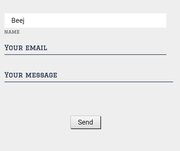
The associated JavaScript checks to see if the input fields are in focus or have been filled and adds the class ‘input–filled’ to fields that have been dirtied. This will come into play with the CSS.

The example that I found used a JavaScript library called Classie.js to add classes to the fieldset element. It took me a moment to realize the reason for this is so one doesn’t need the entire jQuery library. Since I already needed jQuery I didn’t see the point in another library so I adjusted to use jQuery instead of Classie.js. If building a site that doesn’t require jQuery though I would suggest using this library.

1
2
3
4
5
6
7
8
9
10
11
12
13
14
15
16
17
18
19
20
21
22
function ContactForm() {
[].slice.call(document.querySelectorAll('.input')).forEach(function(inputEl) {
// in case the input is already filled..
if (inputEl.value.trim() !== '') {
jQuery(this).parent('fieldset').addClass('input--filled');
}
// events:
inputEl.addEventListener('focus', onInputFocus);
inputEl.addEventListener('blur', onInputBlur);
});
function onInputFocus(ev) {
jQuery(this).parent('fieldset').addClass('input--filled');
}
function onInputBlur(ev) {
if (ev.target.value.trim() === '') {
jQuery(this).parent('fieldset').removeClass('input--filled');
}
}
}

In the CSS below you can see the transition and transformation made when the input element is in focus or when filled. The input field itself is hidden until the label is selected and then the label transitions to below the input element. This creates a pretty cool effect demonstrated in the following image.

1
2
3
4
5
6
7
8
9
10
11
12
13
14
15
16
17
18
19
20
21
22
23
24
.input:focus,
.input--filled .input {
opacity: 1;
-webkit-transition: opacity 0s 0.3s;
transition: opacity 0s 0.3s;
}
.input:focus + .label::before,
.input--filled .label::before {
-webkit-transform: translate3d(0, 0, 0);
transform: translate3d(0, 0, 0);
}
.input:focus + .label::after,
.input--filled .label::after {
opacity: 0;
}
.input:focus + .label .label-content,
.input--filled .label .label-content {
color: #cbc4c6;
-webkit-transform: translate3d(0, 2.1em, 0) scale3d(0.65, 0.65, 1);
transform: translate3d(0, 2.1em, 0) scale3d(0.65, 0.65, 1);
}

To see the full source code of the themes I’ve built check out my BitBucket account.